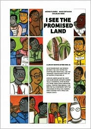
Flowers, A. R. (2010). I see the promised land: A life of Martin Luther King, Jr.. [Chennai], India: Tara Books. ISBN: 978-93-80340-04-3
Author: Arthur Flowers
Website: http://aalbc.com/authors/arthurflowers.htm
Illustrator: Manu Chitrakar
Website: No illustrator website
Design By: Guglielmo Rossi
Website: http://guglielmorossi.com/
Media Used: Painted using traditional Bengali scroll art
Summary: Oral storytelling meets traditional Bengali scroll art to create this graphic novel which tells about the life of Martin Luther King Jr. - the Baptist preacher, Nobel Peace Prize winner, African American civil rights leader - who was assassinated in 1968.
Personal Reaction: Since the text was created by a blues singer who is also a master oral storyteller, I really shouldn't be surprised that the text in this book was so wonderfully put together. The rhythm of the words draw the reader in with its distinct beat. You can see Flowers perform excerpts of the book here. At first I thought that the different font sizes and scattered text would interrupt the flow of my reading, but it had the opposite effect. The way the text was laid out on the page enhances the rhythm of the story. The 2 page spreads with large white text on a black background make you sit up and take notice of the direct quotes from King. The artwork is wonderfully done, helping to drive the story forward, and depicting scenes the struggles of the time. A wonderfully book that is an easy edition to any classroom or school library.
Use of Rhythm: The entire book is set to a particular rhythm making it a good choice for reading aloud.
Curricular Connection: 7th to 12th grade - Civil Rights History & the life of Martin Luther King Jr.
Lesson Plan (under construction): talk about the civil rights movement.
WELCOME
Hi Everyone and welcome to my blog. This site is being constructed as a project requirement for my Master's Program in Library Science from SJSU.
By the end of this Fall10 Semester I should have everything ready to go!
Labels
2009 students' list
(16)
2010/2011 Copyright
(24)
Alliteration
(3)
Allusion
(3)
Award Winner
(48)
Caldecott
(7)
Curricular Connection
(29)
DVD
(14)
Fiction Graphic Novel
(11)
Graphic Novel
(36)
LIBR 262A
(76)
LIBR 264 BookTalk
(6)
LIBR 264 Log
(52)
LIBR 264 Prof Reading
(16)
LIBR 264 SciFi Project
(5)
LIBR 271A
(65)
LIBR 271A Group Assign2
(12)
LIBR 271A My Top Ten
(10)
LIBR 285 Journal
(16)
Lesson Plans
(16)
Manga/Anime
(7)
Metaphor
(4)
Movie
(16)
Newberry
(3)
Non-fiction Graphic Novel
(7)
Onomatopoeia
(5)
Personification
(4)
Picture Books for Older Readers
(27)
Repetition
(4)
Rhyme
(4)
Rhythm
(3)
Simile
(5)
Songs/Poems
(16)
Sophisticated Language
(3)
Symbol
(3)
Website
(5)
Showing posts with label Rhythm. Show all posts
Thursday, July 21, 2011
Thursday, June 30, 2011
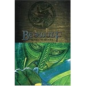
Beowulf
Hinds, G. (2007). Beowulf. Cambridge, MA: Candlewick Press. ISBN: 978-0-7636-3023-2
Original Author: Unknown
Adapted and Illustrated By: Gareth Hinds
Website: http://www.garethhinds.com/
Media Used (discussed in detail): The story of Beowulf is divided into three separate books: Book 1) Beowulf vs. Grendel - which was drawn in ink by using a dip pen and brush, then colored digitally; Book 2) Beowulf vs. Grendel's Mother - which was drawn on painted wood panels using technical pen, watercolor, acrylic, and color pencil; and Book 3) Beowulf vs. the Dragon- which was drawn in ink by using a dip pen and brush, then colored using Dr. Martin's dye and white charcoal. Hinds brilliantly depicts the fighting scenes which are so essential to the story's plot. The jumbled snapshots of Beowulf rolling around, grappling with the monsters, mimic the chaos present in a live fight. Book 1 and Book 3's illustrations were my favorite which I attribute to Hinds' use of drawing with ink with dip pen and brush. I especially like how Hinds uses a map of the constellations as the background image for the dead warrior's pyres on the ocean and for the sky as seen through the banquet hall. The constellations were an eye drawing focal point which had me seeking out the ones I knew. Appropriately accenting Beowulf's death in Book 3, the sober hues are a stark contrast from the vibrant colors used to depict Beowulf's victories.
Summary: Follow the epic tale of Beowulf, in graphic novel format, as he battles barehanded against the evil monster called Grendel, vanquishes Grendel’s vengeful Mother, and fights his final battle against a rampaging dragon in order to protect his kingdom.
Personal Reaction: I really enjoyed this graphic novel adaptation of the epic poem, Beowulf. Hinds did a good job depicting Beowulf and the monsters. The wordless pages which depict certain scenes carries the plot better then if text had been incorporated. Hinds states on his website that the Candlewick Press version of Beowulf is slightly different from the first draft that he self-published. Candlewick Press chose A.J. Church's "more straightforward prose" whereas Hinds originally chose to use Francis Gummere's "more archaically-flavored" translation. I personally liked the choice of wording in the Candlewick Press version, it flowed well and suited the young adult graphic novel audience. An overly archaic worded translation I believe would be off putting to the reader. This adaptation of Beowulf successfully tells the tale of Beowulf on its own, but I would still recommend using it as a supplement in the current curriculum.
"The Classics Revisited" Group Project - Check out our group's presentation of this and other literary classic graphic novel adaptations that we have suggested for high school students.
Adaptation of a single book-length poem
Use of Onomatopoeia: [There are several instances present throughout the text, often incorporated into the graphics rather then the word bubbles]. "Boom" - text seems to be coming from the hall doors as they are opened. "Crunch" - text is closely wrapped near Grendel's mouth as he bits a man's head. "Smash" - written in line with Beowulf's arm and body motion as he drives Grendel's body into a table.
Use of Rhythm: [The wording of Beowulf's speech has a particular cadence that gives the reader a sense of it being presented to a large audience. The '/' represents where the reader might put an emphasis when reading aloud.]
Use of Simile: The image of the ocean is replaced with a map of the constellations thus likening the ocean to the sky.
Curriculum Connection: Grades 9 to 12 Reading Literary Response and Comprehension
California Standard: Narrative Analysis of Grade-Level-Appropriate Text - Read literary texts and use detailed sentences to describe the sequence of events [Read and describe in detail the events that occur in the Beowulf story]. Structural Features of Literature - Identify several literary elements and techniques (e.g., figurative language, imagery, and symbolism); Read and identify ways in which poets use personification, figures of speech, imagery, and the "sound" of language; Identify the functions of dialogue, scene design, and asides in dramatic literature.
Original Author: Unknown
Adapted and Illustrated By: Gareth Hinds
Website: http://www.garethhinds.com/
Media Used (discussed in detail): The story of Beowulf is divided into three separate books: Book 1) Beowulf vs. Grendel - which was drawn in ink by using a dip pen and brush, then colored digitally; Book 2) Beowulf vs. Grendel's Mother - which was drawn on painted wood panels using technical pen, watercolor, acrylic, and color pencil; and Book 3) Beowulf vs. the Dragon- which was drawn in ink by using a dip pen and brush, then colored using Dr. Martin's dye and white charcoal. Hinds brilliantly depicts the fighting scenes which are so essential to the story's plot. The jumbled snapshots of Beowulf rolling around, grappling with the monsters, mimic the chaos present in a live fight. Book 1 and Book 3's illustrations were my favorite which I attribute to Hinds' use of drawing with ink with dip pen and brush. I especially like how Hinds uses a map of the constellations as the background image for the dead warrior's pyres on the ocean and for the sky as seen through the banquet hall. The constellations were an eye drawing focal point which had me seeking out the ones I knew. Appropriately accenting Beowulf's death in Book 3, the sober hues are a stark contrast from the vibrant colors used to depict Beowulf's victories.
Summary: Follow the epic tale of Beowulf, in graphic novel format, as he battles barehanded against the evil monster called Grendel, vanquishes Grendel’s vengeful Mother, and fights his final battle against a rampaging dragon in order to protect his kingdom.
Personal Reaction: I really enjoyed this graphic novel adaptation of the epic poem, Beowulf. Hinds did a good job depicting Beowulf and the monsters. The wordless pages which depict certain scenes carries the plot better then if text had been incorporated. Hinds states on his website that the Candlewick Press version of Beowulf is slightly different from the first draft that he self-published. Candlewick Press chose A.J. Church's "more straightforward prose" whereas Hinds originally chose to use Francis Gummere's "more archaically-flavored" translation. I personally liked the choice of wording in the Candlewick Press version, it flowed well and suited the young adult graphic novel audience. An overly archaic worded translation I believe would be off putting to the reader. This adaptation of Beowulf successfully tells the tale of Beowulf on its own, but I would still recommend using it as a supplement in the current curriculum.
"The Classics Revisited" Group Project - Check out our group's presentation of this and other literary classic graphic novel adaptations that we have suggested for high school students.
Adaptation of a single book-length poem
Use of Onomatopoeia: [There are several instances present throughout the text, often incorporated into the graphics rather then the word bubbles]. "Boom" - text seems to be coming from the hall doors as they are opened. "Crunch" - text is closely wrapped near Grendel's mouth as he bits a man's head. "Smash" - written in line with Beowulf's arm and body motion as he drives Grendel's body into a table.
Use of Rhythm: [The wording of Beowulf's speech has a particular cadence that gives the reader a sense of it being presented to a large audience. The '/' represents where the reader might put an emphasis when reading aloud.]
Therefore/ I shall carry neither sword/ nor shield/ nor coat of mail/ to this battle. With the grip of my hands only/ will I confront this enemy,/ struggling with him, / life for life./ But who shall live/ and who shall die,/ let it be/ as God/ shall will.Use of Personification: [Fate is personified as someone who gives orders that cannot be disobeyed]. "But that which Fate has ordered shall come to pass."
Use of Simile: The image of the ocean is replaced with a map of the constellations thus likening the ocean to the sky.
Curriculum Connection: Grades 9 to 12 Reading Literary Response and Comprehension
California Standard: Narrative Analysis of Grade-Level-Appropriate Text - Read literary texts and use detailed sentences to describe the sequence of events [Read and describe in detail the events that occur in the Beowulf story]. Structural Features of Literature - Identify several literary elements and techniques (e.g., figurative language, imagery, and symbolism); Read and identify ways in which poets use personification, figures of speech, imagery, and the "sound" of language; Identify the functions of dialogue, scene design, and asides in dramatic literature.
Friday, June 17, 2011
Brave Margaret
San Souci, R. D. (1999). Brave Margaret: An Irish adventure. New York, NY: Simon & Schuster Books for Young Readers.
ISBN: 0-689-81072-5
Author: Robert D. San Souci
Website: http://www.rsansouci.com/
Illustrator: Sally Wern Comport
Website: http://www.artatlargeinc.com/
Media Used (discussed in detail): The book's text is set in Clearface Roman and the illustrations were originally done in pastels. Pastels are one of my favorite mediums as they offer a chalky yet vibrant look to the illustrations. The pastels also allow for a wonderful blending of colors which helps to give the illustrations a unique textured look. The book's illustrations are mostly set up in a portrait like fashion - depicting certain action scenes that are described in the text in a way that highlights the emotions and feelings of the story. My two favorite scenes are the opening picture in which Margaret is leading her cows, due to the bright use of color, and the scene where the the old woman becomes young again using the water of healing because of how life like the glow of the the healing water is.
Summary: Retells the Irish folktale of Brave Margaret, a young woman who falls in love with a ship's captain, battles a sea serpent, and defeats a giant troll.
Personal Reaction: The illustrations of this book really help to highlight the different important events that happen throughout the story. The story flows well making it a good candidate for reading aloud to a group despite the length. The depiction of a strong female heroine in a traditional folktale is always a welcomed reading addition. Margaret's only desire is to travel and be with her love, Simon, in all other things she is brave and selfless. I also like how the author ended the tale. Rather then a traditional "happily ever after" or "the end" phrase, I particularly like San Souci's ending sentence: "Their wedding lasted nine nights and nine days, but their happiness lasted a lifetime."
Use of Rhythm: "Fee, fum, fo, fay, What foolish mortal comes this way? Churl or champion, king's son or knave, One blow of my club puts you in your grave!"
Use of Rhyme: (masculine rhyme - a rhyme in which the stress is on the final syllable of the words)
Use of Personification: "The stones of the black castle danced when the giant slammed the ground with his club."
Use of Alliteration: "But Margaret, spurred on by the sight of Simon's lifeless body, charged forward."
Use of Onomatopoeia: “The monster hissed but hesitated.”
ISBN: 0-689-81072-5
Author: Robert D. San Souci
Website: http://www.rsansouci.com/
Illustrator: Sally Wern Comport
Website: http://www.artatlargeinc.com/
Media Used (discussed in detail): The book's text is set in Clearface Roman and the illustrations were originally done in pastels. Pastels are one of my favorite mediums as they offer a chalky yet vibrant look to the illustrations. The pastels also allow for a wonderful blending of colors which helps to give the illustrations a unique textured look. The book's illustrations are mostly set up in a portrait like fashion - depicting certain action scenes that are described in the text in a way that highlights the emotions and feelings of the story. My two favorite scenes are the opening picture in which Margaret is leading her cows, due to the bright use of color, and the scene where the the old woman becomes young again using the water of healing because of how life like the glow of the the healing water is.
Summary: Retells the Irish folktale of Brave Margaret, a young woman who falls in love with a ship's captain, battles a sea serpent, and defeats a giant troll.
Personal Reaction: The illustrations of this book really help to highlight the different important events that happen throughout the story. The story flows well making it a good candidate for reading aloud to a group despite the length. The depiction of a strong female heroine in a traditional folktale is always a welcomed reading addition. Margaret's only desire is to travel and be with her love, Simon, in all other things she is brave and selfless. I also like how the author ended the tale. Rather then a traditional "happily ever after" or "the end" phrase, I particularly like San Souci's ending sentence: "Their wedding lasted nine nights and nine days, but their happiness lasted a lifetime."
Use of Rhythm: "Fee, fum, fo, fay, What foolish mortal comes this way? Churl or champion, king's son or knave, One blow of my club puts you in your grave!"
Use of Rhyme: (masculine rhyme - a rhyme in which the stress is on the final syllable of the words)
"Fee, fum, fo, fay,
What foolish mortal comes this way?
Churl or champion, king's son or knave,
One blow of my club puts you in your grave!"
Use of Personification: "The stones of the black castle danced when the giant slammed the ground with his club."
Use of Alliteration: "But Margaret, spurred on by the sight of Simon's lifeless body, charged forward."
Use of Onomatopoeia: “The monster hissed but hesitated.”
Subscribe to:
Posts (Atom)